| 일 | 월 | 화 | 수 | 목 | 금 | 토 |
|---|---|---|---|---|---|---|
| 1 | 2 | 3 | 4 | 5 | 6 | |
| 7 | 8 | 9 | 10 | 11 | 12 | 13 |
| 14 | 15 | 16 | 17 | 18 | 19 | 20 |
| 21 | 22 | 23 | 24 | 25 | 26 | 27 |
| 28 | 29 | 30 |
- AI이미지 생성
- 왕홍체험 프롬프트
- 나노바나나
- 이미지 생성 자동화
- NanoBananaPro
- 쇼핑몰AI활용
- 이미지생성
- 나노바나나2 프롬프트
- 프롬프트
- 제미나이 왕홍
- AI이미지생성
- 핀터감성
- ai프롬프트
- ai마케팅
- 룩북만들기
- 스마트스토어 이미지
- NANOBANANA PRO
- 제미나이
- 왕홍필터
- 구글이미지생성
- ai 프롬프트
- 나노바나나 프로
- 제미나이 프롬프트
- 카페포스터 만들기
- AI모델착용샷
- 나노바나나 프롬프트
- 나노바나나pro
- 상세페이지 이미지 생성
- 나노바나나2
- 나노바나나프로
- Today
- Total
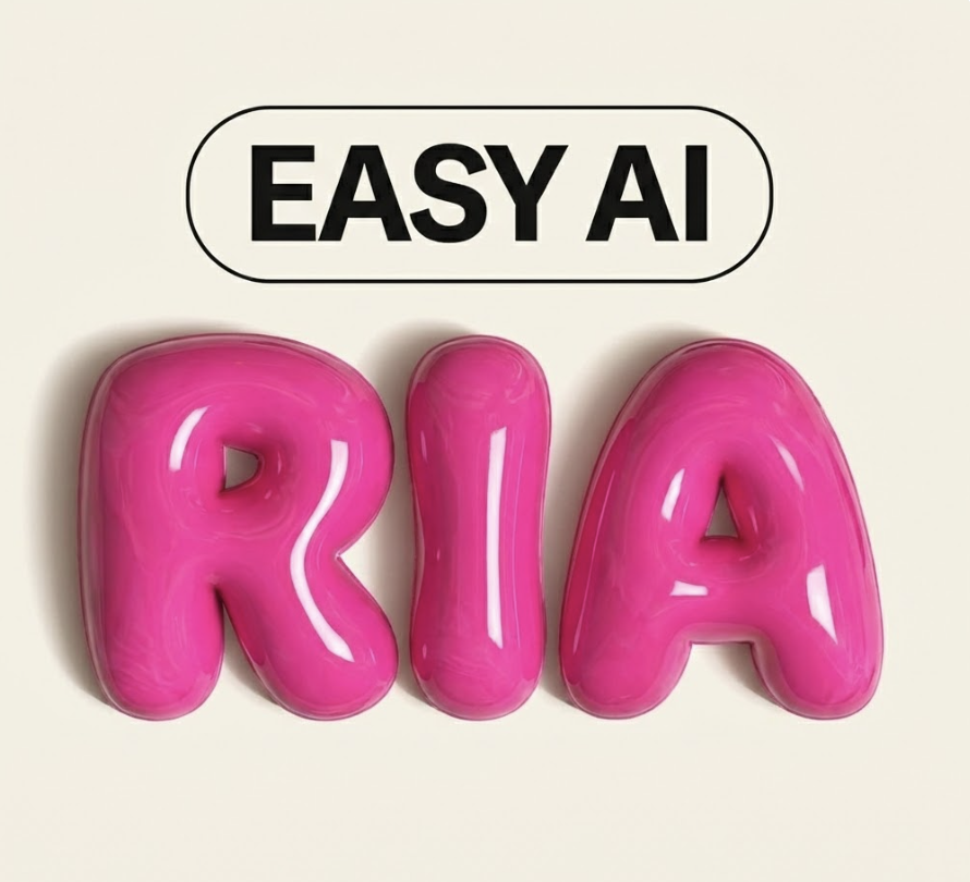
리아의 AI 연구소
나노바나나 프로로 1분도 안 걸리는 메탈 재질 포스터 만들기 본문
핀터레스트에서 힙한 디자인에는 꼭 이게 들어가더라구요? 바로 크롬 메탈 느낌의 3D 타이포그래피인데요, 저도 이거 보자마자 "이거 나노바나나로 되겠는데?" 싶어서 바로 만들어봤습니다. 진짜 1분도 안 걸려서 완성돼서 깜짝 놀랐어요. 나노바나나, 합성 참 잘합니다.

프롬프트
먼저 프롬프트부터 바로 드릴게요. 복사해서 쓰시면 됩니다!
Use the attached reference image as the MATERIAL + LIGHTING reference only.
Recreate the same ultra-polished liquid chrome / molten metal surface, mirror-like reflections, smooth rounded edges, and glossy specular highlights.

Generate a 3D typographic sculpture that spells:
"Hello AI"

Typography requirements:
- Single connected piece where possible (as a cohesive sculptural object)
- Thick, rounded, inflated letterforms (soft bevels, no sharp corners)
- Highly reflective liquid-chrome finish matching the reference
- Clean silhouette, readable from a frontal 3/4 view

Scene & render:
- Studio product render, softbox lighting, high contrast reflections
- Minimal background: pure white or very light gray seamless backdrop
- Subtle soft shadow under the object, no clutter
- Centered composition, fill the frame nicely (not too much empty space)

Quality:
- Ultra high resolution, razor-sharp focus, 8k look, high detail, noise-free
- Physically-based rendering, realistic reflections, HDRI-style highlights

Framing / aspect ratio:
- Output aspect ratio: 1:1
- Leave safe margins so the text is not cropped.

Do NOT copy any shapes from the reference image—only transfer the material, lighting, and rendering style.
"Hello AI" 부분만 내가 원하는 텍스트로 바꿔주시면 돼요. 브랜드명이나 이름, 짧은 문구 넣으면 바로 나만의 메탈 포스터 완성이에요.
만드는 방법 (진짜 간단해요)
STEP 1. 레퍼런스 이미지 찾기
제일 먼저 해야 할 건 내가 원하는 메탈 재질의 레퍼런스 이미지를 찾는 거예요.
핀터레스트에서 "liquid chrome texture", "molten metal surface", "chrome 3D" 이런 키워드로 검색하면 엄청 많이 나옵니다. 저는 아래처럼 다양한 크롬/메탈 질감 이미지를 모아뒀어요. 그리고 유사한 재질들을 확인하고 원하는 재질을 캡쳐해서 가져옵니다.

여기서 중요한 포인트가 하나 있는데요, 이 레퍼런스 이미지는 재질감과 조명 참고용으로만 사용하는 거예요. 형태를 따라 하는 게 아니라 그 반짝이는 느낌, 반사되는 질감만 가져오는 거라서 어떤 형태의 크롬 이미지든 상관없어요.
STEP 2. 프롬프트 입력하기
나노바나나 프로(제미나이)에 레퍼런스 이미지를 첨부하고, 위에 있는 프롬프트를 그대로 복붙하면 됩니다.
Use the attached reference image as the MATERIAL + LIGHTING reference only.
Recreate the same ultra-polished liquid chrome / molten metal surface, mirror-like reflections, smooth rounded edges, and glossy specular highlights.
Generate a 3D typographic sculpture that spells:
"Hello Al"
Typography requirements:
Single connected piece where possible (as a cohesive sculptural object) Thick, rounded, inflated letterforms (soft bevels, no sharp corners) Highly reflective liquid-chrome finish matching the reference Clean silhouette, readable from a frontal 3/4 view
Scene & render:
Studio product render, softbox lighting, high contrast reflections Minimal background: pure white or very light gray seamless backdrop Subtle soft shadow under the object, no clutter Centered composition, fill the frame nicely (not too much empty space)
Quality:
Ultra high resolution, razor-sharp focus, 8k look, high detail, noise-free Physically-based rendering, realistic reflections, HDRI-style highlights
Framing / aspect ratio:
Output aspect ratio: 1:1 Leave safe margins so the text is not cropped.
Do NOT copy any shapes from the reference image-only transfer the material, lighting, and rendering style.
재질 지정 부분 — 첨부한 레퍼런스에서 액체 크롬 같은 표면, 거울 반사, 부드러운 모서리, 광택 하이라이트만 가져오라고 지정해요.
타이포그래피 부분 — 글자를 3D 조각처럼 만들되, 두껍고 둥글고 풍선처럼 부풀어 오른 형태로 만들어달라는 거예요. 날카로운 모서리 없이 부드럽게요.
씬 & 렌더 부분 — 스튜디오 촬영 느낌으로, 흰 배경에 소프트박스 조명, 은은한 그림자까지. 제품 촬영하듯이 깔끔하게 렌더링해달라는 설정이에요. 이 부분도 수정하고 싶으시면 수정해서 사용하시면 됩니다.
퀄리티 부분 — 8K급 초고해상도, 노이즈 없이 선명하게, 물리 기반 렌더링으로 현실감 있는 반사까지 잡아달라는 내용이에요.
비율 부분 — 1:1 정방형에 텍스트가 잘리지 않도록 여백을 두라는 지시예요. 만약에 스토리용(9:16) 이나 4:5 비율로 변경하고 싶으면 이 부분을 수정하시면 됩니다.

마무리
앞으로도 제가 실제로 써보고 괜찮았던 프롬프트 위주로 계속 공유해 볼 예정입니다.
궁금한 거 있으면 편하게 댓글이나 DM 주세요 :)
'맛도리 프롬프트 저장소' 카테고리의 다른 글
| 2026 트렌드 과일코어! 내 제품으로 럭셔리 과일 연출샷 만드는 만능 프롬프트 공개 (0) | 2026.03.13 |
|---|---|
| 우리집 주인님 사진으로 패션 화보 찍는 법 (0) | 2026.03.12 |
| 돌고돌아 Y2K 디카 감성, 나노바나나2 프롬프트 공유 (0) | 2026.03.09 |
| 1초만에 핀터레스트 여신 되는 법 (feat. 나노바나나2) (0) | 2026.03.06 |
| AI로 만드는 미감 좋은 브랜드 포스터, 나노 바나나 2 프롬프트 (0) | 2026.03.03 |


